
Introduction
In a world where over half of all web traffic comes from mobile devices, ensuring your site looks and works flawlessly on phones and tablets is no longer optional—it’s essential. A mobile-responsive design adapts to varying screen sizes and input methods, offering users a seamless experience that boosts engagement and conversions.
1. Why Mobile-First Matters
With smartphones now the primary way people browse the internet, Google and other search engines prioritize mobile-friendly sites in their rankings. Brands that invest in responsive design see higher visibility and enjoy significant SEO advantages.
2. Enhancing User Experience
Responsive layouts automatically adjust navigation, images, and text for easy reading and interaction on small screens. Visitors stay longer, explore more pages, and are more likely to convert when they don’t have to pinch, zoom, or scroll awkwardly.
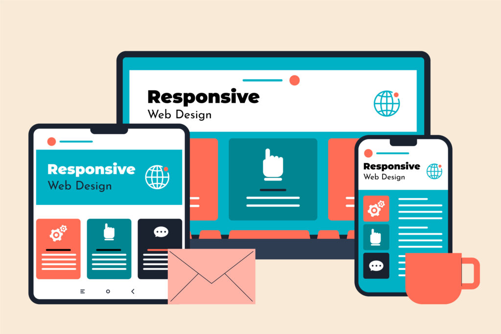
3. Adapting to Diverse Devices
Beyond phones and tablets, responsive design ensures compatibility with emerging form factors—from foldable screens to smart TVs and in-car displays. Future-proofing your site means it remains accessible as technology evolves.
4. Improved Performance and Speed
Mobile-optimized sites load faster by prioritizing essential content and delivering appropriately sized images and assets. Faster load times reduce bounce rates and support better search rankings.

5. Streamlined Maintenance and Scalability
Rather than building separate desktop and mobile versions, a single responsive codebase simplifies updates and feature rollouts. This unified approach saves development time and ensures consistency across all devices.
Conclusion
As we move deeper into 2025, a mobile-responsive web design is the cornerstone of any successful online presence. By embracing responsive principles—flexible layouts, optimized assets, and adaptive navigation—you’ll deliver an exceptional experience, maximize reach, and stay ahead of the curve.
Resources & Further Reading
- Google’s Mobile-Friendly Test
- Articles on responsive framework best practices
- Case studies: Before & after responsive redesigns